It is an agreeable fact that designing a website demands a person to be really creative. But, what makes the design worth is its functionality factor and an efficient web designer should not forget that while designing a portal for the client.
The current Product Designer and UX Expert at Facebook, Cameron Moll has aptly defined a web designer’s job as opposed to that of an artist by quoting “What separates design from art is that design is meant to be…functional.”
A design which only has a ‘wow’ factor to look at but cannot be developed into a smoothly functional one would only be as good as purchasing yourself a cool biker jacket while going for desert safari in Dubai. And you certainly don’t want to invest in something that you know would not be of any use. And when we talk about a website, the design should be such that it is easy and pleasing for the users and not for you or the owner/client.
So, what is it that makes a website attractive while ensuring that it does not appear fussy?
If you are looking for an answer to this question, then you are on the right blog because we have some expert tips by our designer team for you that can come handy when you are creating a professional website next time.
-
Search & Research
Designing is an ever evolving industry. You cannot ever be an absolute expert or completely aware of all the trends in the designing industry as they change very rapidly. So, before you begin designing for your website, explore some of the other portals that focus on specific purposes and see what you like about those designs and what you don’t. However, make sure that you are just referring those designs for some inspiration and not resorting to plagiarism activities.

- Eliminate All the Clutter
What mostly disappoints a user and forces him to leave a website is the fact that there is just so much clutter everywhere with so many elements being thrown on a single page. We see websites with banners, badges, pop-ups, icons, buttons, ads, videos and much more at a single place and the clutter is so much that it usually becomes a noise. Give your users a break from it all and embrace things like white space and flat design.

- Consistent and Clean Layout
There is definitely not a single layout which is preferred in any of the industries, but you should ensure that the layout syncs with your content displaying requirements while augmenting the usefulness of the website. The scrolling type, sizes of sidebars, alignment and other such elements should be consistent throughout the website. There cannot be anything more displeasing than viewing different layouts on each page of single portal.

- Focus on the Content
Visual elements make a website look appealing, but content is the most important part of any portal. Unless users know what the website is for and what they are supposed to do there, it won’t serve the purpose. So make sure that while you are putting up the text on website, your color schemes should be in sync, the font size should be optimized in manner that it is readable. In fact, choose such fonts (maximum 3) which the brand can stick to.
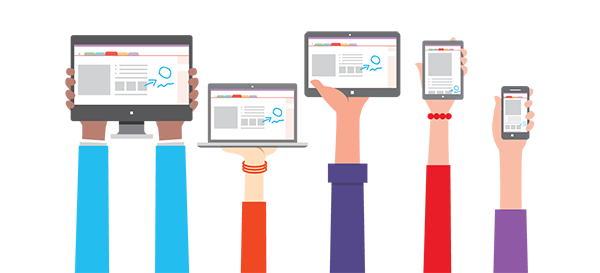
- Think About Multi-Platforms
Do not begin designing the website unless you have a clear picture of how it would look on the mobile devices. In a world where we are continuously emphasizing on the fact that web portals should be responsive, it is essential that the website design must look as good on the mobile screen of your user as appealing it looks on the desktop screen. After all, most of the traffic these days is coming from mobile websites rather than desktop and you don’t want to lose those potential users.
Final Words…
Being a web designer, you must pay attention to each component of the website. Remember that an effective website does not necessarily have to look really flashy or full of visual creativities, rather it should be clear and simple.
In fact, if you will take a look at the websites of big giants in the industries, the first thought that might come across your mind is that they are really simple. Well, you should also be aware that those simple websites have more traffic and are liked more by users because of the sophisticated functionality.
Source: BZ


